

The Wrong Table: Thirty Years of Olympics, Recounted Honestly
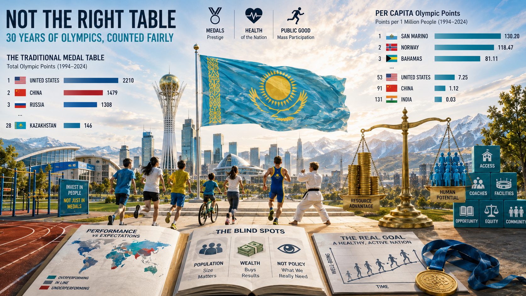
The medal table measures the size of a country before anything else: economists showed the result is predicted almost entirely by population and GDP. We recalculated all sixteen Olympics from 1994 to 2024 per head of population — the United States falls from 1st to 53rd, China from 2nd to 91st, India lands 131st of 132.
But “medals per capita” is not the final answer either — the top of that list is held by San Marino, on the strength of three medals in thirty years. And most importantly: no version of the medal table answers the question public sports budgets are justified by. The correlation between medals per capita and whether a country’s population actually moves is statistically zero.
Every two years the world publishes the same table. Countries are ranked by gold medals, commentators talk about sporting superpowers, ministries report on their top-ten placing, and the losers promise to “draw conclusions.” The table looks like an objective result: here is the competition, here is the outcome, nothing to argue about.
There is something to argue about. This table answers a different question from the one we ask it.
What the medal table actually measures
Economists settled this a quarter of a century ago. In “Who Wins the Olympic Games,” published in the Review of Economics and Statistics, Andrew Bernard and Meghan Busse showed that a country’s medal haul is predicted almost entirely by two variables: population and gross domestic product. Not school quality, not the number of coaches, not sporting tradition. Size and money.
The logic is almost embarrassingly simple. Talent is born at roughly the same rate everywhere. More people means more talent. More money means a higher chance that talent gets found, developed into a national-team athlete, and flown to the Games. The medal table is, broadly, a ranking of countries by headcount, lightly adjusted for wealth.
Which means “the United States is the world’s greatest sporting nation” says roughly the same thing as “the United States has the world’s largest GDP.” True, but not about sport.
The test: 16 Olympics, recounted
Rather than argue in the abstract, we ran the numbers.
Method. All 16 Games across thirty years: eight Summer (1996–2024) and eight Winter (1994–2022). The window opens after the collapse of the USSR, at the point where Kazakhstan and the other post-Soviet states compete in their own right rather than as part of the Unified Team. Medals are converted to points on the proposed quality scale: gold 3, silver 2, bronze 1. Each country’s population for each Games year comes from the World Bank; the denominator is the period average. Medals follow current IOC standings — that is, after reallocations resulting from doping disqualifications: Russia is now credited with 18 golds from London 2012, not the 24 announced at the Games themselves.
Over these thirty years, 132 countries won medals. Here is their table — first as the world prints it, then immediately as it looks once divided by population.
| Country | Points | Medals | Population | Points per mln | Rank per mln | |
|---|---|---|---|---|---|---|
| 1 | 🇺🇸 United States | 2210 | 1071 | 304.7 mln | 7.25 | 53 |
| 2 | 🇨🇳 China | 1479 | 687 | 1325.8 mln | 1.12 | 91 |
| 3 | 🇷🇺 Russia | 1308 | 660 | 145.0 mln | 9.02 | 49 |
| 4 | 🇩🇪 Germany | 1192 | 592 | 82.2 mln | 14.50 | 33 |
| 5 | 🇬🇧 Great Britain | 804 | 404 | 62.6 mln | 12.84 | 35 |
| 6 | 🇫🇷 France | 790 | 413 | 64.2 mln | 12.30 | 37 |
| 7 | 🇦🇺 Australia | 727 | 377 | 21.9 mln | 33.13 | 14 |
| 9 | 🇯🇵 Japan | 668 | 338 | 126.7 mln | 5.27 | 58 |
| 13 | 🇳🇴 Norway | 579 | 277 | 4.9 mln | 118.47 | 2 |
For three decades, first place in the world belonged to a country that ranks in the fifties on efficiency. China, the planet’s second sporting superpower, comes 91st of 132. Japan, 58th. India — home to one in six people alive — won 27 medals in thirty years and finishes 131st of 132; only Pakistan, with one medal, is lower.
And at the top sits Norway: 13th on the conventional table, and 118.5 points per million inhabitants — sixteen times the American figure.
The original intuition holds completely: the table the world has used for thirty years to judge sports policy is upside down. Countries that stood at its summit for decades sit near the bottom on efficiency.
But dividing by population breaks at the second step
Now the honest part. Left as the only metric, this produces a mirror-image error — and one just as crude.
Here is who actually leads “points per million” when all 132 countries are counted:
| Country | Points per mln | Total medals in 30 years | Population |
|---|---|---|---|
| 🇸🇲 San Marino | 130.20 | 3 | 33 thousand |
| 🇳🇴 Norway | 118.47 | 277 | 4.9 mln |
| 🇧🇸 Bahamas | 81.11 | 13 | 0.36 mln |
| 🇬🇩 Grenada | 71.92 | 5 | 0.11 mln |
| 🇯🇲 Jamaica | 52.39 | 70 | 2.7 mln |
| 🇧🇲 Bermuda | 47.81 | 1 | 0.06 mln |
| 🇩🇲 Dominica | 43.72 | 1 | 0.07 mln |
San Marino is “the world’s most sporting nation” on the basis of three medals in thirty years. Bermuda and Dominica enter the global top ten having won a single medal each in their entire history. That is not the efficiency of a sports policy. That is small-number statistics: where a hundred thousand people live, one gifted individual overturns the whole table.
A metric in which a country’s standing is decided by whether one outstanding athlete happened to be born there is no better than a metric decided by how many people live there. In both cases we are measuring chance, just of a different kind.
There is a second, less obvious objection. We measured the relationship between points per million and GDP per capita: the correlation coefficient is +0.68. That is high. Medals per capita is also, to a large degree, a wealth ranking — just a subtler one. Switzerland, the Netherlands, Austria, Sweden, Australia and Denmark sit high on that list not only because they organized youth sport well.
Three lenses instead of one
The right conclusion is not to swap one bad single number for another. It is to look at a country from several angles at once, and to compare not the absolute figure but the deviation from what was expected.
We calculated how many points a country “should” have won given its population and its economy, then divided the actual figure by that expectation. For countries above 3 million people:
| Country | Actual / expected | Points won | Expected |
|---|---|---|---|
| 🇳🇴 Norway | ×18.7 | 579 | 31 |
| 🇳🇿 New Zealand | ×10.7 | 209 | 20 |
| 🇬🇪 Georgia | ×9.5 | 88 | 9 |
| 🇭🇺 Hungary | ×8.0 | 295 | 37 |
| 🇭🇷 Croatia | ×7.5 | 117 | 16 |
| 🇦🇹 Austria | ×6.8 | 301 | 45 |
| 🇸🇪 Sweden | ×6.6 | 321 | 48 |
| 🇳🇱 Netherlands | ×6.6 | 593 | 89 |
| 🇦🇺 Australia | ×6.6 | 727 | 110 |
| 🇧🇾 Belarus | ×6.2 | 184 | 30 |
| … | |||
| 🇮🇩 Indonesia | ×0.12 | 61 | 517 |
| 🇳🇬 Nigeria | ×0.10 | 32 | 309 |
| 🇸🇦 Saudi Arabia | ×0.05 | 6 | 126 |
| 🇮🇳 India | ×0.02 | 38 | 1948 |
| 🇵🇰 Pakistan | ×0.01 | 3 | 281 |
Now this looks like measuring policy rather than size. Georgia, with 4 million people and a $45 billion economy, wins nine and a half times what its resources predict. India wins fifty times less: given its population and economy it “should” have taken around 1948 points, and took 38. That is a policy failure in its purest form — and no absolute table will show it, because on the absolute table India sits 57th and looks unremarkable.
The third lens is money. Points per trillion dollars of GDP at purchasing power parity: 🇬🇪 Georgia 1964, 🇳🇴 Norway 1413, 🇦🇲 Armenia 1168, 🇳🇿 New Zealand 1141, 🇭🇺 Hungary 1032, 🇰🇪 Kenya 915, 🇪🇹 Ethiopia 650. Here the countries that get results without money rise to the top.
The medal weights barely matter
The quality coefficients deserve a separate note, because they usually attract the most argument.
We recalculated the table four ways: 3–2–1, 4–2–1, gold only, and all medals equal. The top dozen countries barely changes — Norway, New Zealand, Switzerland, the Netherlands, Austria, Sweden, Australia and Hungary appear in different orders, but they are the same countries.
The conclusion is unwelcome for anyone who enjoys arguing about weights: which coefficient you assign to silver is almost irrelevant. Everything is decided by a single operation — dividing by population. The rest is decoration.
One further correction is owed in fairness. Norway stands so high largely on the Winter Games: on Winter alone it takes 94.3 points per million, more than three times second-placed Austria. Winter sport requires snow, mountains and money, and the Winter table is effectively a closed club of wealthy cold countries. Counting Summer Games only, the picture softens: 🇳🇿 New Zealand first (44.9), then 🇦🇺 Australia (30.9), 🇭🇺 Hungary (28.9), 🇨🇺 Cuba (27.6) — and 🇳🇴 Norway only fifth (23.9).
And now the real question
Suppose we have built a perfect measure of medal efficiency. What, exactly, have we measured?
Sport is funded from public budgets on three promises: the nation’s health, the public good, and national prestige. The medal table — even recalculated per capita — measures only the third. The question is whether the third pulls the first two along with it.
It is assumed that it does: victories inspire, children join clubs, the nation starts moving. This has a name — the trickle-down effect. And it has a problem: it barely survives contact with evidence.
A systematic review in the Journal of Physical Activity and Health, pooling studies of elite sport’s effect on population physical activity, concludes that there is no evidence elite sport increases physical activity in the general population. Three systematic reviews found no effect from hosting major events. Individual studies — on Danish handball, on table tennis in Germany, France and Austria — reach the same conclusion: champions’ successes do not bring the public into sport. Where an effect is found, it is usually confined to people who were already active and simply switched disciplines.
We tested this against our own data. We took the WHO indicator — the share of adults with insufficient physical activity in 2022 — and matched it against points per million across 95 countries with populations above 3 million.
Correlation coefficient: −0.02.
Zero. A country’s per-capita medal success says precisely nothing about whether its people move.
Individual cases explain why. South Korea — 12.55 points per million, a strong sporting nation on any measure — has 60.7% of its adults insufficiently physically active, one of the worst rates in the world. Japan: 5.27 points per million, 50.6% inactive. And in reverse: Kenya, at 7.5% inactive one of the most physically active societies on the planet, ranks 60th on points per capita. Uganda: 4.2% inactive and 0.5 points per million.
These are two entirely different phenomena that we habitually call by one word, “sport.” One is an industry for selecting and preparing a few hundred people to world level. The other is whether an ordinary person walks, plays in the yard, and reaches eighty without diabetes. Between them there is no measurable link.
🇳🇴 Norway: the country that wins everything and still sits down
This deserves a pause, because Norway is the standard exhibit — and we have just placed it first ourselves.
The Norwegian youth-sport model genuinely is unique. The Norwegian Olympic Committee’s official Provisions on Children’s Sport prohibit league tables and national championships for children under 13. Results from youth competitions may not be published as rankings. Until adolescence, sport is participation and skill, not selection and pressure. Norway also retains more than 70% of teenagers in sport at the age when the rest of the world sees a mass exodus.
And here is the fact that spoils the tidy story: according to the WHO, 38.1% of adult Norwegians are insufficiently physically active — worse than the global average of 31%. Its neighbours do incomparably better — Sweden 10.7%, Finland 12.0%, the Netherlands 11.4% — while winning fewer medals per head.
One caveat is required, without which the conclusion would be dishonest: the WHO indicator rests on national surveys, and a threefold gap between neighbouring Nordic countries almost certainly reflects differences in survey methodology as well as real behaviour. But that is precisely why sports policy cannot be built on any single number — medal or medical.
The lesson from the Norwegian case is different, and more interesting: even a country with the world’s best youth-sport system and an absolute record in medal efficiency has not thereby solved the problem of national health. Because these are different problems, solved with different instruments.
What a medal costs
There is one more dimension that almost never reaches the tables: price.
Britain keeps this statistic in the open. For the Paris 2024 cycle, UK Sport invested £245.8 million and got 65 medals — roughly £3.78 million per medal. For the Tokyo cycle the figure was about £3.5 million. The spread within that total is enormous: cycling, on a budget of around £30 million, produced 13 medals at roughly £2.5 million each, while boxing, on £12 million, produced a single bronze.
Twelve million pounds for one bronze medal is, at current rates, more than the entire annual state budget of Kazakhstani cycling and chess combined. The same money would build and maintain a substantial number of sports grounds within walking distance of where people live. No medal table — absolute or per capita — shows that trade-off. It shows only the medal.
🇰🇿 Kazakhstan in these tables
Over thirty years Kazakhstan won 86 medals — 146 points on the 3–2–1 scale. That is 28th in the world on the absolute table.
Per million inhabitants: 8.40, which is 51st of 132. Among countries above 3 million people, 31st of 96. On the actual-to-expected ratio adjusted for population and economy: ×2.45, 29th of 96. On points per trillion of GDP, 30th.
All four lenses give the same answer, which is a good sign of robustness: Kazakhstan performs appreciably above its resources, but nowhere near its ceiling. For comparison, among neighbours: 🇬🇪 Georgia ×9.5, 🇧🇾 Belarus ×6.2, 🇦🇲 Armenia ×5.4, 🇦🇿 Azerbaijan ×3.8, 🇲🇳 Mongolia ×4.6, 🇺🇿 Uzbekistan ×1.9. In its own region Kazakhstan is a solid upper-middle performer, not the leader the absolute table depicts.
The second half of the picture is more interesting: where the money goes. According to open data on state funding of Kazakhstani sport in 2024, ice hockey received roughly 51 billion tenge, football about 32 billion, professional cycling 6.0 billion, chess 5.5 billion, and national sports about 4.7 billion. Athletics received 521.8 million tenge.
Ice hockey receives roughly a hundred times what athletics does. Athletics is running — the cheapest and most universal way to get a population moving, and simultaneously the most medal-dense discipline of the Summer Games. Ice hockey is professional clubs. The point is not that hockey is unnecessary; the point is that the spending structure is optimized neither for health nor even for medals, but for spectacle and representation.
Meanwhile the official mass-participation statistics look reassuring: 46.5% of the population aged three and over were covered by physical culture and sport in 2024, 47.7% in 2025, with a target of 50% by 2029. The WHO data for Kazakhstan are also decent: 28.4% of adults insufficiently active, better than the global 31%. But provision of sports infrastructure stands at 59.6%, some 1,400 of 7,000 football pitches need repair, and the country is short roughly 1,700 more. The gap between “coverage” in the report and the pitch in the yard is where the real conversation lies.
What to measure instead of medals
If the medal table answers only the question of prestige, while the money is spent on three promises, then there should be three groups of indicators.
Health. The share of adults and adolescents meeting the WHO-recommended 150 minutes of activity per week. This is what the state funds sport for in the first place: the WHO estimates that physical inactivity will cost the world’s health systems around $300 billion over 2020–2030 — roughly $27 billion a year. Today 31% of the world’s adults (1.8 billion people) and 81% of adolescents are insufficiently active, and the trend is worsening: 23.4% in 2000, 31.3% in 2022.
Public good. Not “people covered by events,” but physical access: how many people live within a 15-minute walk of a free pitch, pool or hall. How many children stay in sport past 13 — the age at which the drop-off happens worldwide. The Norwegians measure exactly this, and not by accident.
Prestige. Medals — but with two mandatory adjustments: for population and for money spent. And with the cost of each medal published, as Britain does.
None of these substitutes for the others. A country can rank first on any one of them and last on the other two — and international practice demonstrates this regularly.
What follows
The original thesis holds: the absolute medal table is an obsolete and misleading measure. It ranks countries by size and wealth while presenting this as an assessment of sports policy. Recounting thirty years of Olympics shows it unambiguously: the United States falls from first to fifty-third, China from second to ninety-first.
But replacing one number with another does not solve the problem — it only reverses its sign: instead of large countries, the top fills with very small ones where a single person decides everything. What works is not a single metric but the comparison of actual performance against what the resources predict — and several lenses that check one another.
And the most important thing these data show lies outside the original argument entirely. We have spent thirty years debating how to rank countries by medals — and the link between medals per capita and whether a population moves is zero. Which means we have been optimizing the wrong indicator all along. The medal table — any version of it, absolute or per capita — is not a report on the nation’s health, and never was.
A country’s real sporting rank is not a line in a table once every four years. It is the share of people who, on an ordinary Tuesday, left the house and moved.
Sources
Olympic medal tables, 1994–2024 (current IOC standings, including medal reallocations):
- Summer Games medal tables: 1996, 2000, 2004, 2008, 2012, 2016, 2020, 2024
- Winter Games medal tables: 1994, 1998, 2002, 2006, 2010, 2014, 2018, 2022
Population and economy:
- World Bank: total population (SP.POP.TOTL)
- World Bank: GDP, PPP, constant prices (NY.GDP.MKTP.PP.KD)
The economics of Olympic success:
- Bernard A., Busse M. Who Wins the Olympic Games: Economic Resources and Medal Totals. Review of Economics and Statistics, 2004
- Working-paper version, NBER Working Paper 7998
- Statista: population-adjusted medal table for Paris 2024
Population physical activity:
- WHO Global Health Observatory: insufficient physical activity among adults, by country (indicator NCD_PAC)
- National, regional and global trends in insufficient physical activity, 2000–2022. The Lancet Global Health, 2024
- WHO: Physical activity fact sheet
- WHO: first-ever global report on physical activity — the cost of inactivity, 2022
The trickle-down effect:
- Effect of elite sport on physical activity practice in the general population: a systematic review. Journal of Physical Activity and Health, 2022
- Can international elite sport success trickle down to mass sport participation? Danish handball. European Journal of Sport Science, 2018
- Table tennis in Germany, France and Austria: are there trickle-down effects
The cost of a medal and the youth-sport model:
- How much UK Sport funding each Team GB medal cost in Paris
- UK Sport: investment in the Olympic cycle
- Norwegian Olympic Committee: Provisions on Children’s Sport and children’s rights in sport
Kazakhstan:
- The most heavily funded sports in Kazakhstan: where the billions go
- Almost half of Kazakhstanis play sport, but the infrastructure is lacking
- Concept for the development of physical culture and sport in Kazakhstan, 2023–2029
Notes on the calculations. Team-sport medals are counted as one medal, following the Olympic convention; this favours countries strong in individual disciplines. Neutral-flag performances (ROC 2020, ROC 2022, Olympic Athletes from Russia 2018) are attributed to Russia; teams without a country — Individual Neutral Athletes 2024, Independent Olympic Athletes 2016, and the Refugee Olympic Team — are excluded. Yugoslavia and Serbia and Montenegro are consolidated into Serbia. Taiwan’s population is taken from national statistics, as Taiwan is not in the World Bank database. The World Bank does not publish PPP GDP for Cuba, North Korea, Taiwan, Venezuela, Eritrea and Liechtenstein, so those countries are excluded from the “per trillion of GDP” and “actual/expected” calculations.
If you have found a mistake or a typo in this article, tell us about it
Comments (0)
Log in to leave a comment →
No comments yet. Be the first.