


Physics around us: from a first experiment to your own lab Lesson 7 of 8
Tables, graphs, and limits of a conclusion
Organise results and plot two points without pretending to know an entire curve.
Where we are on the map
The map shows the reasoning order. Its numbers are worked examples unless the lesson explicitly identifies your own measurement. You are in the first of eleven blocks.
A question from daily life
Six time readings on separate scraps are hard to compare. A table gathers like measurements; a graph shows how the result changes when a condition changes.
Words and meanings
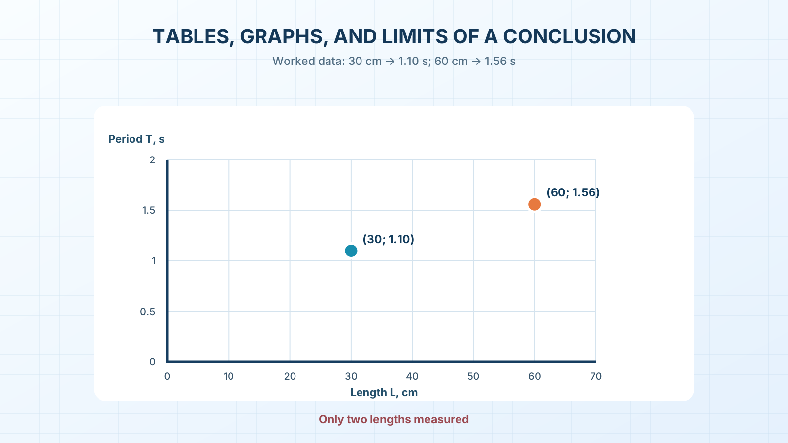
A table arranges data in rows and labelled columns. A graph puts pairs of values on two axes: the horizontal axis shows chosen length L, the vertical axis measured period T. A data point is one pair (L; T) from one case. A relationship here tells how T changes as L changes. An axis scale states how many units one step on the drawing represents. Two points do not establish the precise shape of a whole relationship or what happens outside the tested lengths.
Predict before checking
Worked mean times for ten swings: at 30 cm, 11.0 s; at 60 cm, 15.6 s. Predict whether the 60 cm point will sit above or below the 30 cm point on a graph of period against length.
Do it and record it
Make a table labelled ‘L, cm’, ’t₁₀, s’, ‘T, s’. Add rows 30 | 11.0 | 1.10 and 60 | 15.6 | 1.56. Draw an L axis from 0 to 70 cm and a T axis from 0 to 2.0 s; mark (30; 1.10) and (60; 1.56). Do not join the points as though intermediate values had been measured.
| Length L, cm | Time for 10 swings t₁₀, s | Period T, s |
|---|---|---|
| 30 | 11.0 | 1.10 |
| 60 | 15.6 | 1.56 |
A worked example
The difference in this worked example is 1.56 − 1.10 = 0.46 s. Honest conclusion: these data have a larger mean period at 60 cm than at 30 cm. ‘Double the length doubles the period’ is false here: 1.56 is not 2.20.
A common mistake
Starting the T axis at 1.0 s makes the difference look huge. A cropped scale needs a clear label and explanation. Our first graph starts at zero so the drawing does not exaggerate the difference.
A new situation
A friend measured 45 cm but lost the time record. Can a graph with two points tell the exact period at 45 cm? You can make a guess, but not call it a measurement. What new experiment is needed?
Notebook entry and self-check
Put the table and graph in your notebook with units on both axes. State the result in one sentence and its limit in another: ‘Only two lengths were tested.’
If you have found a mistake or a typo in this article, tell us about it
Comments (0)
Log in to leave a comment →
No comments yet. Be the first.