


Informatics: build your own digital assistant Lesson 50 of 72
How a chart can lie with true numbers
Draw an honest chart and see how the same true numbers can create a false impression.
Where we are on the map
Lesson 50 of 72, Data, tables and databases block (47–54). We continue assistant 1.1 with three fictional tasks. By the end, records live in local SQLite while tested reminder rules remain unchanged.
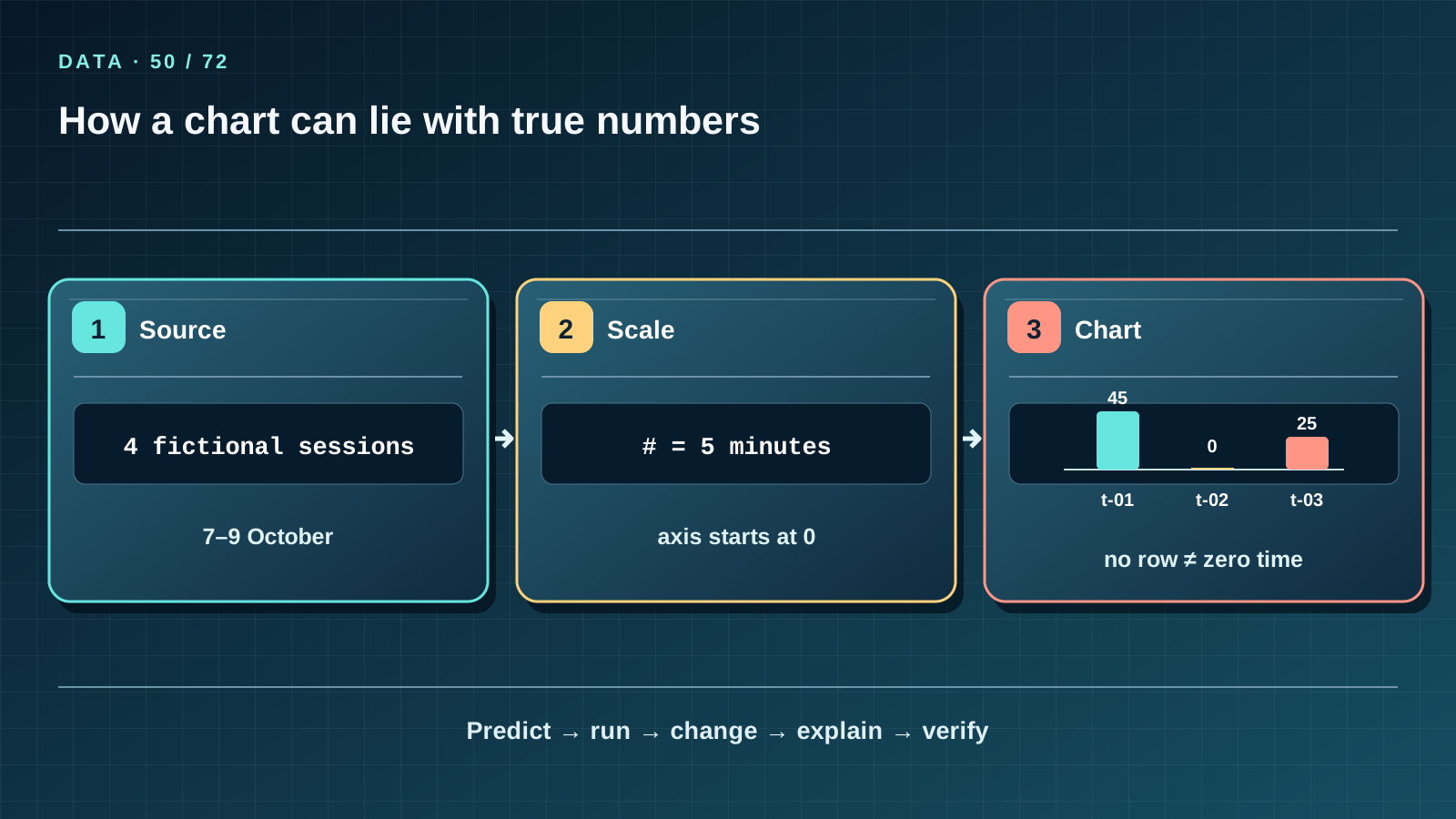
Situation and question
The tasks show 45, 0 and 25 recorded minutes. A chart with a cropped vertical axis makes 45 look enormously larger than 25. No number has been forged, yet the impression is misleading.
New words without gaps
A bar chart compares categories by length; its quantitative axis usually starts at zero. A scale maps numbers to visible lengths. The axis baseline is the number at the start. The sample is the included observations: just four fictional sessions here. No record is different from a timed zero-minute session: t-02 totals zero because it has no sessions. A caption should name unit, period and source.
The lesson’s support signal
Read the map left to right. Name each arrow’s input, transformation and check. Cover the third step and predict it. Then locate the matching row in CSV, SQL or the report: an arrow must not replace real values or relationships.
Work through it step by step
Let one # represent five minutes: t-01 gets nine symbols, t-03 five, t-02 none. Start the scale at zero. Add ‘Fictional records, 7–9 October 2026, minutes, n=4’. Now imagine an axis beginning at 20: 45 and 25 will appear much farther apart. Explain why the impression changes although the values do not.
Predict and check
Write the exact expected output, including row order, before running anything. Execute the snippet in step-05 and compare characters. Change one input, then predict, run and explain again. The example proves only the stated rule; fictional teaching data do not become measurements of real people.
totals = [("t-01", 45), ("t-02", 0), ("t-03", 25)]
for task_id, minutes in totals:
    print(task_id, "#" * (minutes // 5) or "(none)")
Expected output
t-01 #########
t-02 (none)
t-03 #####
Catch the error
Removing t-02 and saying ’every task was studied’ is false. Making one bar wider to suggest a larger value also changes the impression. Four fictional sessions cannot support claims about all learners in Kazakhstan.
Project change
Keep a text chart as a checkable view of the 1.2 report. Put the source table and scale rule beside it: the chart is a view of data, not a second independent source.
Task and evidence
Draw three bars in five-minute steps, show a zero baseline and cite the fictional source. Make a deliberately misleading version and explain to a classmate exactly where it distorts meaning.
Transfer to a new setting
An official chart shows a percentage rising from 48 to 52. Which labels and baseline will you inspect before calling it an ’explosive rise’?
Return after 1, 7, and 30 days
After 1 day redraw the map from memory and name a case where the simple analogy fails. After 7 days explain a fresh table without the text and answer at least 7 of the final lesson’s 10 questions. After 30 days repeat import into a temporary folder and check three tasks, four sessions, total 70 and unchanged reminders. Record any unclear term and return to its first definition.
Primary reference to check
Next lesson
If you have found a mistake or a typo in this article, tell us about it
Comments (0)
Log in to leave a comment →
No comments yet. Be the first.