

Python: from data to your own digest Lesson 33 of 56
matplotlib: the first chart, and a file rather than a window
The thirty-second lesson of the Python course. We draw the series from the last lesson: a sheet and axes, a line, labels, a grid, a legend — and save it to a file without a single window opening. Plus the three things that break a chart for everybody: `Agg`, the order of drawing before saving, and a figure nobody closed.
Why this matters
Thirty numbers in a table take half a minute to read, and afterwards nothing about them is clear. The same thirty as a line take a second: the series is rising, there was a jump on 26 January, and it did not happen again.
There is a price for that. A chart is the most convincing way to show data and the easiest to fake with: the same numbers on another scale say something else. The next lesson deals with that — the scale, the zero and the labels. Today it is how to draw and save at all.
The library is installed where pandas already lives:
pip install matplotlib==3.11.1
The whole thing first
The file is grafik.py. The same series of rates as in lesson thirty-one, and both lines: the real one and the smoothed one.
"""Lesson 32: the first chart.

The same series of rates as in the previous lesson. We draw a line, label the
axes, save it to a file -- and not one window opens on the screen.
"""

import matplotlib

# No screen: a program on a schedule draws into a file rather than a window.
# This line goes before pyplot is imported -- after that it is too late, pyplot
# will have chosen another way to draw.
matplotlib.use("Agg")

import matplotlib.pyplot as plt
import pandas as pd
from pathlib import Path

HERE = Path(__file__).resolve().parent

days, rates = [], []
start = pd.Timestamp("2026-01-05")
for i in range(40):
    day = start + pd.Timedelta(days=i)
    if day.weekday() >= 5:
        continue
    value = 512.0 + i * 0.35 + ((i * 7) % 11 - 5) * 0.6
    if i == 21:
        value += 14.0
    days.append(day)
    rates.append(value)
rate = pd.Series(rates, index=pd.DatetimeIndex(days, name="day"), name="rate").round(2)

# Figure is the sheet of paper, Axes are the axes on it. All drawing goes
# through ax.
fig, ax = plt.subplots(figsize=(8, 4))
ax.plot(rate.index, rate.values, color="#b03a2e", linewidth=1.6, label="rate")
ax.plot(rate.index, rate.rolling(5).mean(), color="#7f8c8d", linewidth=1.2,
        linestyle="--", label="rolling mean, 5 days")

ax.set_title("The rate, January to February 2026")
ax.set_xlabel("day")
ax.set_ylabel("tenge per dollar")
ax.grid(True, linewidth=0.4, alpha=0.5)
ax.legend()
fig.autofmt_xdate()

out = HERE / "kurs.png"
fig.savefig(out, dpi=150, bbox_inches="tight")
plt.close(fig)

print("points on the chart:", len(rate))
print("lines on the axes:", len(ax.get_lines()))
print("the Y label:", ax.get_ylabel())
print("file:", out.name, "| created:", out.exists(), "| not empty:", out.stat().st_size > 0)
It prints:
points on the chart: 30
lines on the axes: 2
the Y label: tenge per dollar
file: kurs.png | created: True | not empty: True
And kurs.png appears beside the program — the picture itself.
Going through it
Agg: a program with no screen
matplotlib.use("Agg") is the first line for a reason. By default matplotlib looks for a way to show a window, and a program started by a scheduler at four in the morning (lesson twenty-three) has no screen. Agg means “draw into a file”, and with it no window is wanted at all.
It has to come before import matplotlib.pyplot: pyplot picks its way of drawing when it is imported, and after that it is too late to change.
Hence the unusual order of imports in the program: matplotlib first, then the use line, and only then pyplot. It is the one place in this course where the imports do not stand together, and a linter complains about it — and it only works this way.
The sheet and the axes
fig, ax = plt.subplots(figsize=(8, 4)) makes two things:
figis the sheet of paper: it has a size in inches and it is what gets saved;axare the axes on that sheet: things are drawn on them, labelled on them, and the grid is theirs.
There is a shorter way — plt.plot(...) — but then you are drawing on the “current” axes, which the library keeps somewhere of its own. While there is one chart it makes no difference; the moment there are two, the current axes turn out to be the wrong ones. Through ax that mistake cannot happen, and the lessons of this course use nothing else.
figsize is given in inches rather than pixels: the pixels appear on saving, when dpi is applied to the inches.
The line and how it looks
ax.plot(x, y) draws a line. What is worth setting explicitly:
color— colour is what tells series apart; keep the same one for the same series across all your charts;linewidth— the thickness; the main thing gets the thicker line;linestyle="--"— dashes for what is secondary: the smoothed line in the example is dashed not for looks but so that nobody takes it for the data;label— the text for the legend; without itax.legend()has nothing to show.
Labels are not decoration
A chart with no axis labels is a picture, not data. Four lines that always get written:
ax.set_title(...)    what this is at all
ax.set_xlabel(...)   what runs across
ax.set_ylabel(...)   what runs up, and in what units
ax.legend()          which line is which
ax.grid(True, linewidth=0.4, alpha=0.5) adds a grid — a pale one, so that it helps read values off rather than argues with the lines. fig.autofmt_xdate() turns the dates when they no longer fit.
savefig: the format comes from the extension
fig.savefig("kurs.png", dpi=150, bbox_inches="tight"):
- the format is taken from the extension:
.pngfor an email or a messenger,.svgfor a page (it scales without losing anything),.pdffor print; dpiturns inches into pixels: 8 inches at 150 is 1200 dots across. For a screen 100–150 is enough; print takes 300;bbox_inches="tight"trims the empty margins, which otherwise leave air around the picture.
The main rule is the order: savefig photographs what is drawn at the moment it is called. Save before plot and you get an empty sheet, with no error of any kind. That is the third drill.
close: figures do not disappear by themselves
plt.close(fig) releases the sheet. With one chart it goes unnoticed; a program that draws one picture a day and never closes them gets a warning on the twenty-first day and eats memory after that. The habit is simple: drawn, saved, closed.
pandas can do it itself
Series and DataFrame have a .plot() of their own, and it draws with the same matplotlib:
ax = rate.plot(figsize=(8, 4), color="#b03a2e")
ax.set_ylabel("tenge per dollar")
It returns the same Axes, so labelling and saving go as usual: ax.figure.savefig(...). That is the shorter way to glance at data. For a report somebody will see, an explicit fig, ax is the usual choice — everything that happens is visible in it.
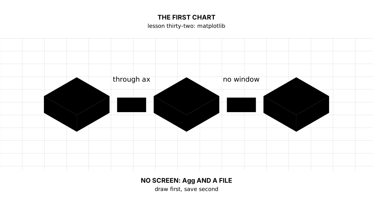
The map of this lesson
Say it in your own words
Without looking, answer out loud or on paper. The answers are at the end of the lesson.
- What is the line
matplotlib.use("Agg")for, and why does it stand before pyplot is imported? - How does
figdiffer fromax, and why does this course draw throughax? - What comes out if
savefigis called beforeplot, and is there an error?
The warm-up
Three short steps before the exercise: predict, fill in, fix. The answers are at the end, but answer for yourself first.
1. Predict. What does this program print?
import matplotlib

matplotlib.use("Agg")

import matplotlib.pyplot as plt

fig, ax = plt.subplots(figsize=(6, 3))
ax.plot([1, 2, 3], [10, 12, 11], label="ряд")
ax.set_title("a trial")
ax.set_ylabel("tenge")
print("lines:", len(ax.get_lines()), "| title:", ax.get_title(), "| Y label:", ax.get_ylabel())
print("sheet size:", fig.get_size_inches().tolist(), "inches")
plt.close(fig)
2. Fill in the blank. In place of ... put the way of drawing that needs no screen.
# without this line a program on a schedule goes looking for a window
import matplotlib

matplotlib.use(...)

import matplotlib.pyplot as plt

print("the way of drawing:", matplotlib.get_backend())
fig, ax = plt.subplots()
ax.plot([1, 2], [3, 4])
plt.close(fig)
3. Fix it. The file is created and the picture in it is empty. The program prints how many lines were on the axes at the moment of saving.
# saved before anything was drawn
import matplotlib

matplotlib.use("Agg")

import matplotlib.pyplot as plt
from pathlib import Path

HERE = Path(__file__).resolve().parent
fig, ax = plt.subplots()
out = HERE / "proba.png"
fig.savefig(out)
print("lines at the moment of saving:", len(ax.get_lines()))
ax.plot([1, 2, 3], [10, 12, 11])
print("lines at the end of the program:", len(ax.get_lines()))
plt.close(fig)
The exercise
Required. Take the same series and draw it together with the smoothed one. Mark the day of the jump — the one the smoothed line does not show — with a dot and a label. Label the axes and the title, add a legend and a grid. Save two files: kurs.png for an email and kurs.svg for a page. Print: the number of points, the number of lines on the axes, the title, the marked day with its value, and a line about each file.
The expected output:
points: 30 | lines on the axes: 3
title: The rate: the real series and the smoothed one
marked day: 2026-01-26 | value: 532.75
kurs.png: created True, not empty True
kurs.svg: created True, not empty True
Done when: the output matches line for line; use("Agg") stands before pyplot is imported; the drawing goes through ax rather than plt; the saving comes after all the drawing; the figure is closed; and the picture in both files is not empty (open them and look).
On your own data. Draw a series of your own — daily spending, steps, weight. Label the Y axis with its units, without fail. Then show the picture to somebody who has not seen your data and ask what they understood. Everything they did not understand is what the chart is missing.
If you feel like it.
- Save the same chart as
png,svgandpdfand compare the file sizes. - Try
dpi=72anddpi=300and look at the text in the picture. - Draw the same series with
rate.plot(ax=ax)and check that the labels go on the same way.
Where this fits the project
Step thirteen: the report gains a picture. sholu/suret.py draws one line per country and puts the file beside the CSV, taking the names for the legend from the same lookup table the report reads — which is why the picture says “Қазақстан” rather than “KAZ”.
Two lines in that file are there precisely because the digest runs on a schedule rather than in front of a person: matplotlib.use("Agg") before pyplot is imported — there is no screen at four in the morning; and plt.close(fig) after the save — otherwise a program drawing one picture a day learns about unclosed figures on the twenty-first.
Still open. The colours are written into the code as a list. While there are three series that is fine; when there are more they will want to live in one place together with the rest of the report’s appearance.
The answers
To the questions
- It tells matplotlib to draw into a file rather than a window. A program started by a scheduler has no screen to use, and without that line it goes looking for one. It stands before
pyplotis imported because pyplot chooses its way of drawing at import time — after that it is too late. figis the sheet: its size, its margins, the saving.axare the axes on the sheet: the lines, the labels, the grid, the legend. Drawing goes throughaxbecauseplt.plotdraws on the “current” axes, and once there are two charts the current ones are the wrong ones.- An empty picture comes out, and there is no error.
savefigsaves what is drawn at the moment it is called; everything drawn afterwards never reaches the file.
To the warm-up
axknows what has been drawn on it and how it is labelled, whilefigknows its own size in inches — the one given infigsize.
lines: 1 | title: a trial | Y label: tenge
sheet size: [6.0, 3.0] inches
matplotlib.use("Agg"). The name of the drawing method is written as a string, andget_backend()gives the same one back afterwards.
import matplotlib

matplotlib.use("Agg")

import matplotlib.pyplot as plt

print("the way of drawing:", matplotlib.get_backend())
fig, ax = plt.subplots()
ax.plot([1, 2], [3, 4])
plt.close(fig)
the way of drawing: Agg
- Move
savefigafterplot. Zero lines at the moment of saving is the answer itself: the file is empty although the program finished without a single complaint.
import matplotlib

matplotlib.use("Agg")

import matplotlib.pyplot as plt
from pathlib import Path

HERE = Path(__file__).resolve().parent
fig, ax = plt.subplots()
ax.plot([1, 2, 3], [10, 12, 11])
out = HERE / "proba.png"
fig.savefig(out)
print("lines at the moment of saving:", len(ax.get_lines()))
print("lines at the end of the program:", len(ax.get_lines()))
plt.close(fig)
lines at the moment of saving: 1
lines at the end of the program: 1
To the exercise
The dot and the label go on the real series: ax.plot([day], [value], marker="o") and ax.annotate(...). The point of the exercise is that the picture should show exactly what the last lesson was about — the smoothed line passes the event by, and beside it that is visible at a glance.
Both files are saved from one figure: savefig can be called as many times as you like and the figure is none the worse for it. It is closed once, after all the saving.
Sources
- matplotlib quick start —
Figure,Axesand why there are two of them. - Backends — what
Aggis and when it is needed. - Saving figures — formats,
dpiand margins.
If you have found a mistake or a typo in this article, tell us about it
Comments (0)
Log in to leave a comment →
No comments yet. Be the first.